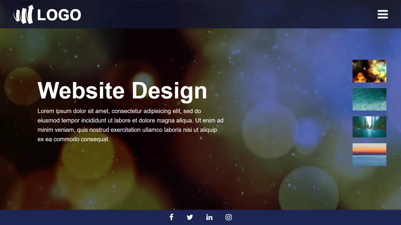
This tutorial blog to learn how to create smooth scrolling transform effect with GreenSock scrolltrigger plugin.
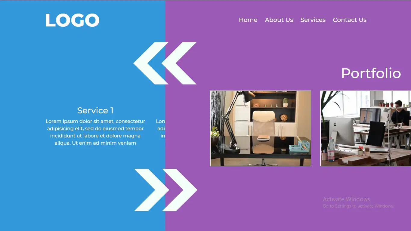
How to create Scrolling Transform Effect Website
Video Tutorial of "How to create Scrolling Transform Effect in Website"
This tutorial video to learn how to create smooth scrolling transform effect in JavaScript.
How to create Scrolling Transform Effect in Website [Source Code]
This source code can help you to create Scrolling Transform Effect in your Website. You can use your own images for this project.
GreenSock scrolltrigger plugin source.
You can also download this source code through the given link. Click here to download source code
Copy
Copy
*,*:after,*:before{
-webkit-box-sizing: border-box;
-moz-box-sizing: border-box;
-ms-box-sizing: border-box;
box-sizing: border-box;
}
body{
font-family: "Montserrat",sans-serif;
font-size: 16px;
margin: 0;
background: #fff;
min-height: 100vh;
background:#000;
position: relative;
}
img{
max-width: 100%;
}
h1,h2{
font-size: 46px;
margin-bottom: 30px;
}
header{
position: fixed;
left: 0;
top:0;
width: 100%;
z-index: 10;
padding: 20px 0;
backdrop-filter:blur(30px);
}
.container{
max-width: 1100px;
margin:0 auto;
width: 100%;
}
header .container{
display: flex;
align-items: center;
justify-content: space-between;
}
.logo{
font-size: 60px;
color: #fff;
text-decoration: none;
font-weight: 900;
}
.main-nav{
padding: 0;
margin: 0;
list-style: none;
}
.main-nav li{
display: inline-block;
margin-left: 20px;
}
.main-nav li a{
color: #fff;
text-decoration: none;
font-size: 20px;
}
.section{
background:#fff;
padding: 20px;
width: 100%;
height: 100vh;
overflow: auto;
color: white;
font-size: 24px;
position: absolute;
display: flex;
align-items: center;
justify-content: space-around;
}
#scroll_section{
height: 100vh;
overflow: hidden;
position: relative;
}
.section.cl1{ background-color: #1abc9c ; position: static;}
.section.cl2{ background-color: #2ecc71 ;}
.section.cl3{ background-color: #3498db ;}
.section.cl4{ background-color: #9b59b6 ;}
.section.cl5{ background-color: #f1c40f ;}
.section.cl6{ background-color: #e74c3c ;}
.portfolio-box{
border:2px solid;
display: flex;
align-items: center;
justify-content: space-around;
}
input:not([type="submit"]),textarea{
width: 100%;
padding: 10px;
font-size: 16px;
margin-bottom: 20px;
outline: 0;
}
textarea{
height: 100px;
}
input[type="submit"]{
background:black;
padding: 10px;
color: #fff;
text-transform: uppercase;
border: 0;
cursor: pointer;
}
input[type="submit"]:hover{
opacity: 0.7;
}
Copy
gsap.registerPlugin(ScrollTrigger);
const tl = gsap.timeline()
tl.from(".cl3",{xPercent:-100})
.from(".cl4",{xPercent:100})
.from(".cl5",{yPercent:-100})
.from(".cl6",{yPercent:100});
ScrollTrigger.create({
animation:tl,
trigger: "#scroll_section",
start: "top top",
end: "+=2000",
scrub:true,
pin:true,
});
for( i = 0;i<=3; i++) {
console.log(i)
}